Project: Full branding for a music festival combining two music styles Course: Second year graphic design, Ort Singalovsky Tel Aviv
This project involved creating a full branding for a music festival that combines two music styles: the 1960s American hippie style and contemporary Israeli rap. The goal was to create a unique and visually appealing identity that would capture the essence of both genres and attract a diverse audience. Tools I used:
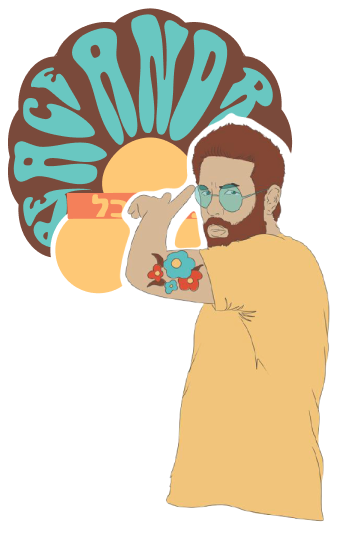
THE LOGO IS COMPOSED OF THE FOLLOWING ELEMENTS
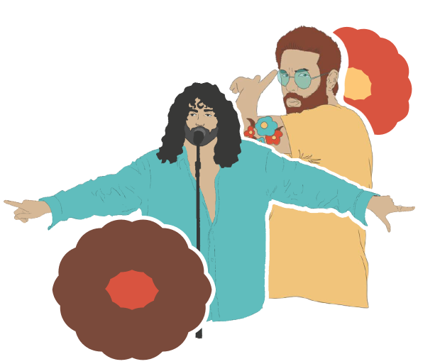
Long hair: This was a characteristic feature of hippies and their fans during the 1960s. Round, oversized glasses: These were also a popular fashion item during the hippie era. Flower: This is a reference to the “flower children” of the 1960s, who used flowers as a symbol of peace and love. Round and playful font: This type of font is characteristic of the hippie era and creates a sense of fun and excitement.
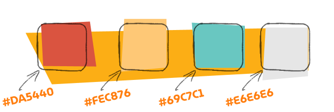
COLOR PALETTE
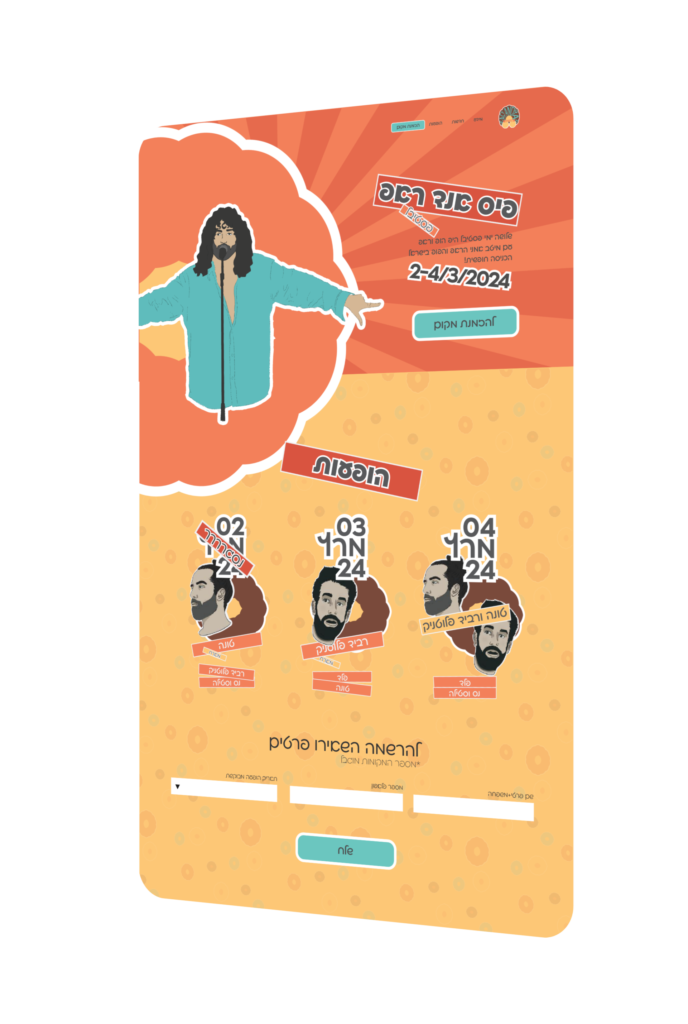
The color palette is inspired by the psychedelic colors of the 1960s and the vibrant colors of contemporary Israeli culture.
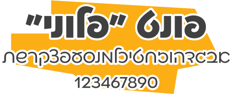
TYPOGRPHY
The typography uses a mix of fonts that reflect the two styles. The fonts are bold and playful, creating a sense of fun and excitement.
IMAGERY
The imagery illustrations that capture the spirit of both styles. The images are colorful and energetic, creating a sense of excitement and anticipation. The illustrations were created using Procreate app. The illustrations are effective in capturing the essence of both the 1960s hippie style and contemporary Israeli rap culture. The illustrations are an important part of the overall branding of the festival and help to create a unique and visually appealing identity.